
- Newest
- Most viewed
Interested in a Link Placement?

Orthopedic Chair vs Ergonomic Chair: Key Differences
Orthopedic chairs offer firm, medical-grade support for pain relief, while ergonomic chairs focus on adjustability to prevent discomfort—learn which suits you best.
Smart Products | May 8, 2025 750 views

Calorie Restriction for Weight Loss: Science, Strategies & Tips
Work Wellness | May 8, 2025 476 views

Brainway App Review: Can It Really Help With Procrastination?
Productivity | May 5, 2025 951 views

Autonomous Mother’s Day Sale 2025 – Terms & Conditions
Latest Updates | May 4, 2025 1,024 views
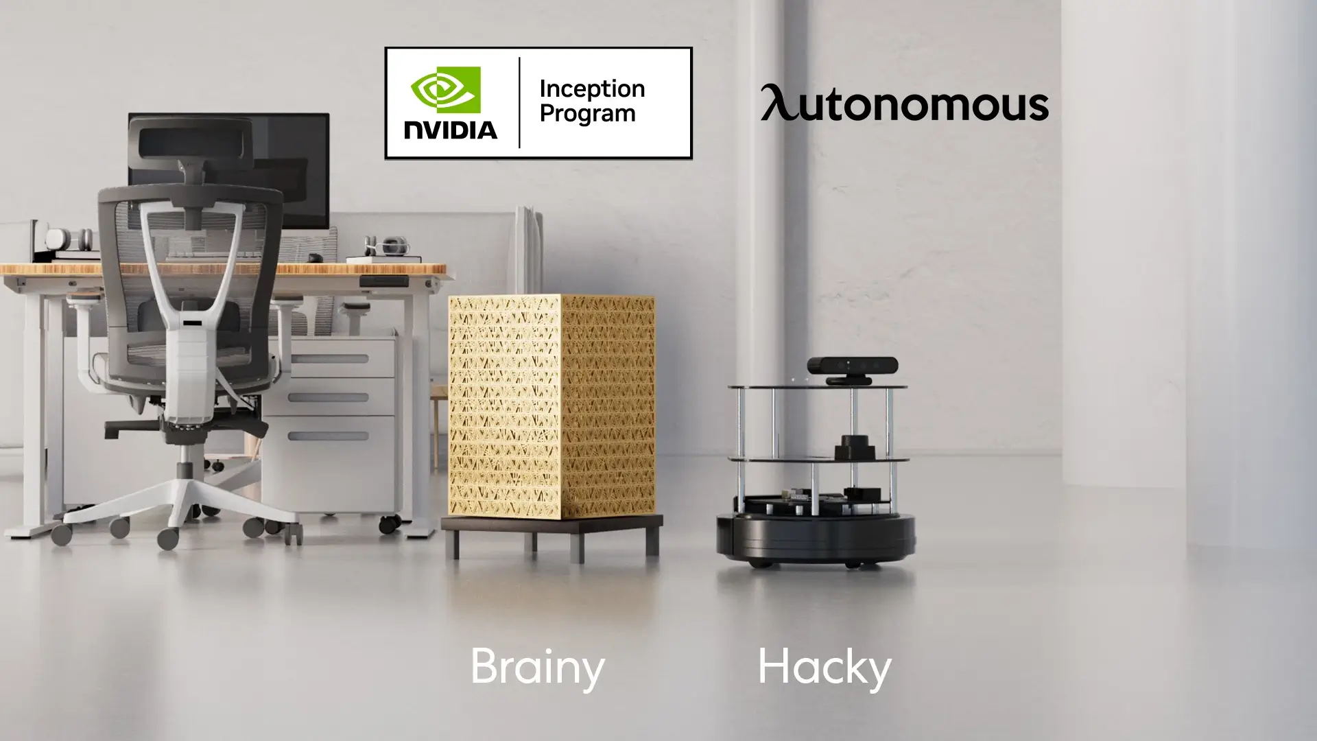
Autonomous Joins NVIDIA Inception Program
Latest Updates | Apr 28, 2025 537 views

Liven App Review: A Mental Wellness Tool for Productivity and Focus
Work Wellness | Apr 28, 2025 901 views
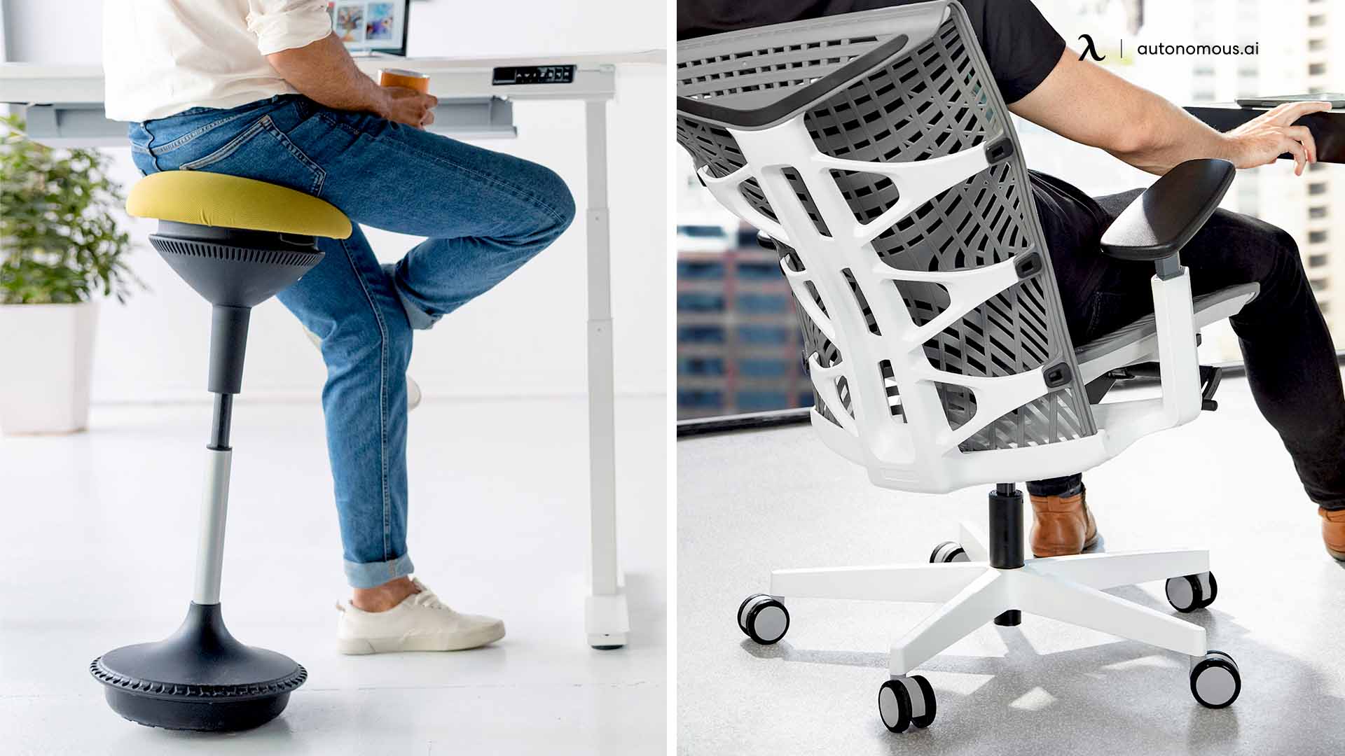
Stool vs. Chair: Which is Better for Your Comfort?
Smart Products | Apr 24, 2025 925 views
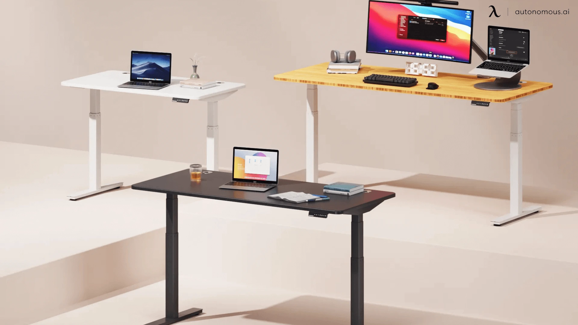
Understanding Standing Desk Prices: What to Expect at Every Budget
Smart Products | Apr 22, 2025 537 views

The 5 Best Office Chairs for Bedroom Setups in 2025
Smart Products | Apr 21, 2025 1,307 views
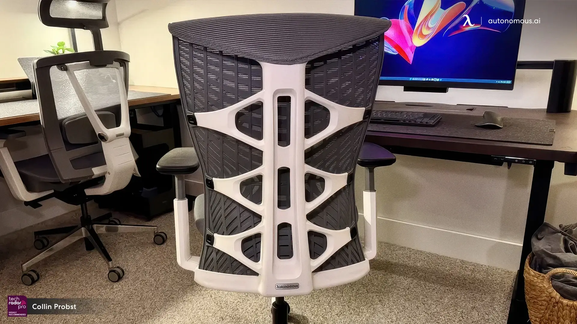
Best Office Chairs for Managers That Lead in Comfort and Support
Smart Products | Apr 18, 2025 1,390 views

Top 5 Adjustable Metal Standing Desks Worth Buying
Smart Products | Apr 17, 2025 986 views
Best Office Chairs for Carpeted Floors: Comfort, Durability, and Style
Smart Products | Apr 16, 2025 1,365 views