Best Paint Colors For Office That Boost Productivity
Table of Contents
The right paint colors for office spaces can do more than just make a room look good. They shape how people feel, think, and work every day. A soft neutral can calm a busy mind, while a bold accent can spark new ideas during brainstorming sessions.
Whether it’s a modern open space or a cozy home office setup, choosing the right wall color sets the tone for focus and creativity. From soothing greens to energizing blues, the best shades can quietly boost productivity without overwhelming the space.
How Paint Colors For Office Impact Mood And Productivity
Color influences how people feel long before they notice it. In a workspace, this subtle shift can shape energy, focus, and overall performance. The right paint colors for office walls create a sense of balance between stimulation and calm—essential for sustained concentration.
Warm tones like soft terracotta or muted yellow can make a space feel lively and inviting, encouraging movement and collaboration. Cooler hues, especially blue paint colors for office settings, tend to steady the mind, supporting focused, deep work. Even neutral shades—when paired with the right lighting—can quietly sharpen attention and ease mental fatigue.
Lighting is the silent partner here. Natural light softens brighter colors and brings out their warmth, while artificial light can deepen cooler shades for a more grounded atmosphere. When both work in harmony, paint and light can subtly guide how a workspace feels throughout the day, boosting energy in the morning and sustaining focus well into the afternoon.
Best Paint Colors For Office Walls In 2025
Choosing the right paint colors for office spaces goes far beyond making them look stylish. The right shade can shape how a room feels, how people work, and how energy flows through the space. In 2025, color trends lean toward tones that blend atmosphere with function—supporting everything from deep focus to creative momentum.
1. Blue – Best For Focused, Calm Work
Shades to try: Sky blue, dusty blue, slate blue, navy
Blue remains one of the most popular office paint colors for good reason. It naturally quiets a room, lowering mental noise and making it easier to focus on deep, individual tasks.
Lighter blues like sky or dusty blue create a fresh, open atmosphere that suits home offices or strategy zones. Darker tones like slate or navy give the room weight and focus, making them a strong fit for executive spaces, meeting rooms, or research teams. Blue works best in rooms that benefit from clear thinking and steady energy — without feeling sterile.
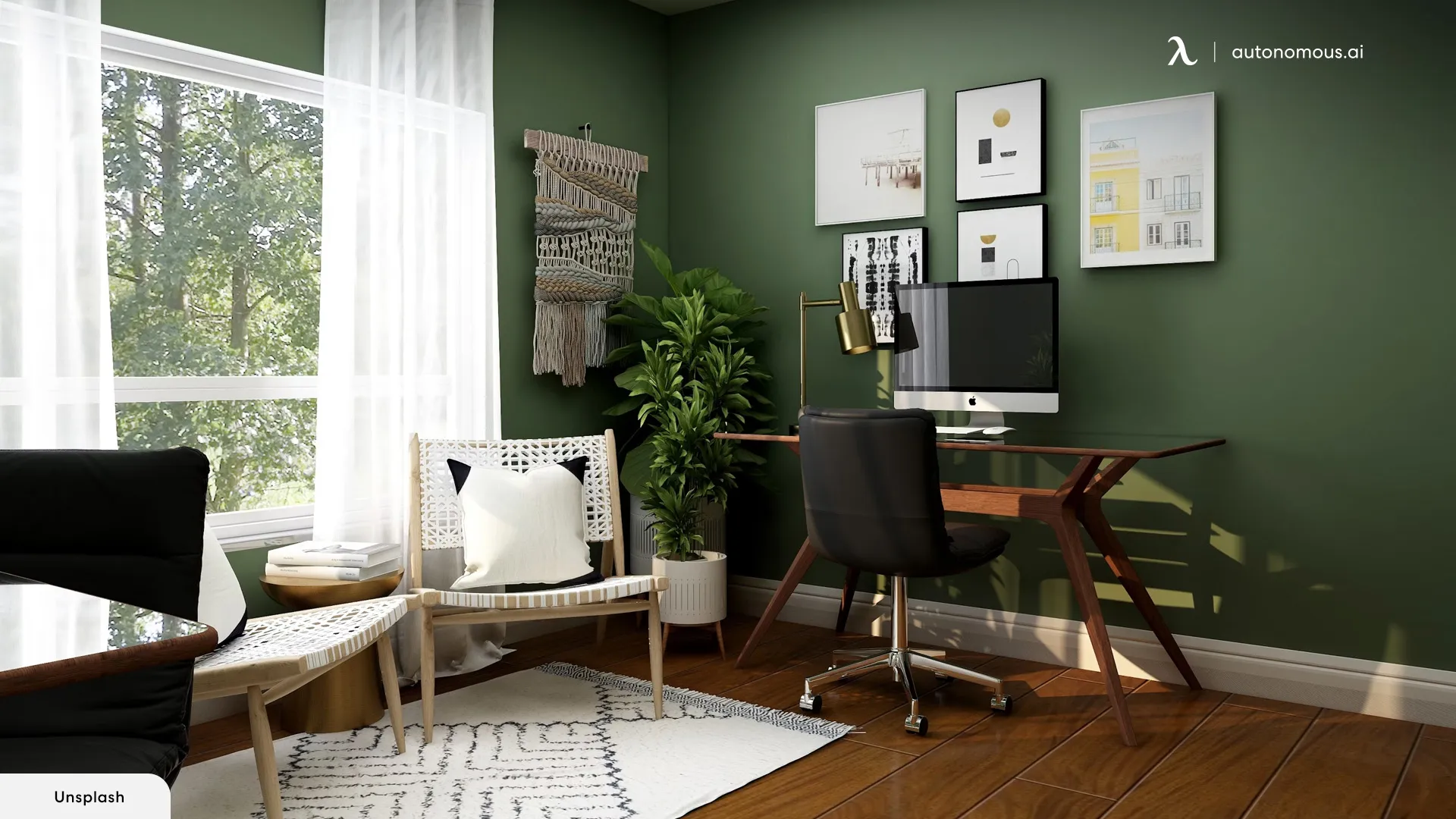
2. Green – Best For Steady And Balanced Energy
Shades to try: Sage green, fern, olive, forest green
Green is perfect for bringing a natural sense of calm into the workplace. It’s easy on the eyes and reduces fatigue during long hours, making it one of the best office paint colors for productivity. It’s also a meaningful shade in home office Feng Shui, often associated with harmony and balance.
Sage and fern greens give creative studios and wellness spaces a relaxed, grounded energy. Olive or forest green can bring quiet sophistication to boardrooms or libraries. Unlike louder colors, green doesn’t compete for attention, which makes it perfect for spaces where calm consistency matters more than stimulation.
3. Gray – Best For Modern, Structured Setups
Shades to try: Dove gray, warm greige, storm gray, charcoal
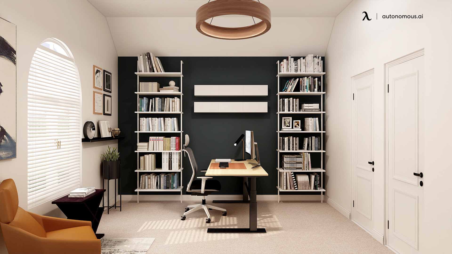
Gray is neutral but never boring. Light tones like dove gray create a clean, professional base for hybrid spaces or open layouts, helping everything in the room feel balanced. Greige warms up the space without losing its minimal feel, great for shared work areas. Darker shades like storm or charcoal give a room structure and maturity, making them ideal for meeting rooms or executive offices. This timeless neutral fits naturally into sleek, modern office design schemes.
4. White – Best For Bright, Flexible Spaces
Shades to try: Warm white, cream, linen white, chalk white
White gives a workspace room to breathe. It reflects natural and artificial light beautifully, making small spaces feel larger and more open. Warm white and cream create a softer, welcoming mood, while chalk white delivers a sharper, modern look.
This neutral backdrop is especially adaptable for personalizing your workspace—whether it leans toward the softer details seen in home office ideas for women or the refined, structured aesthetic highlighted in men’s home office ideas.
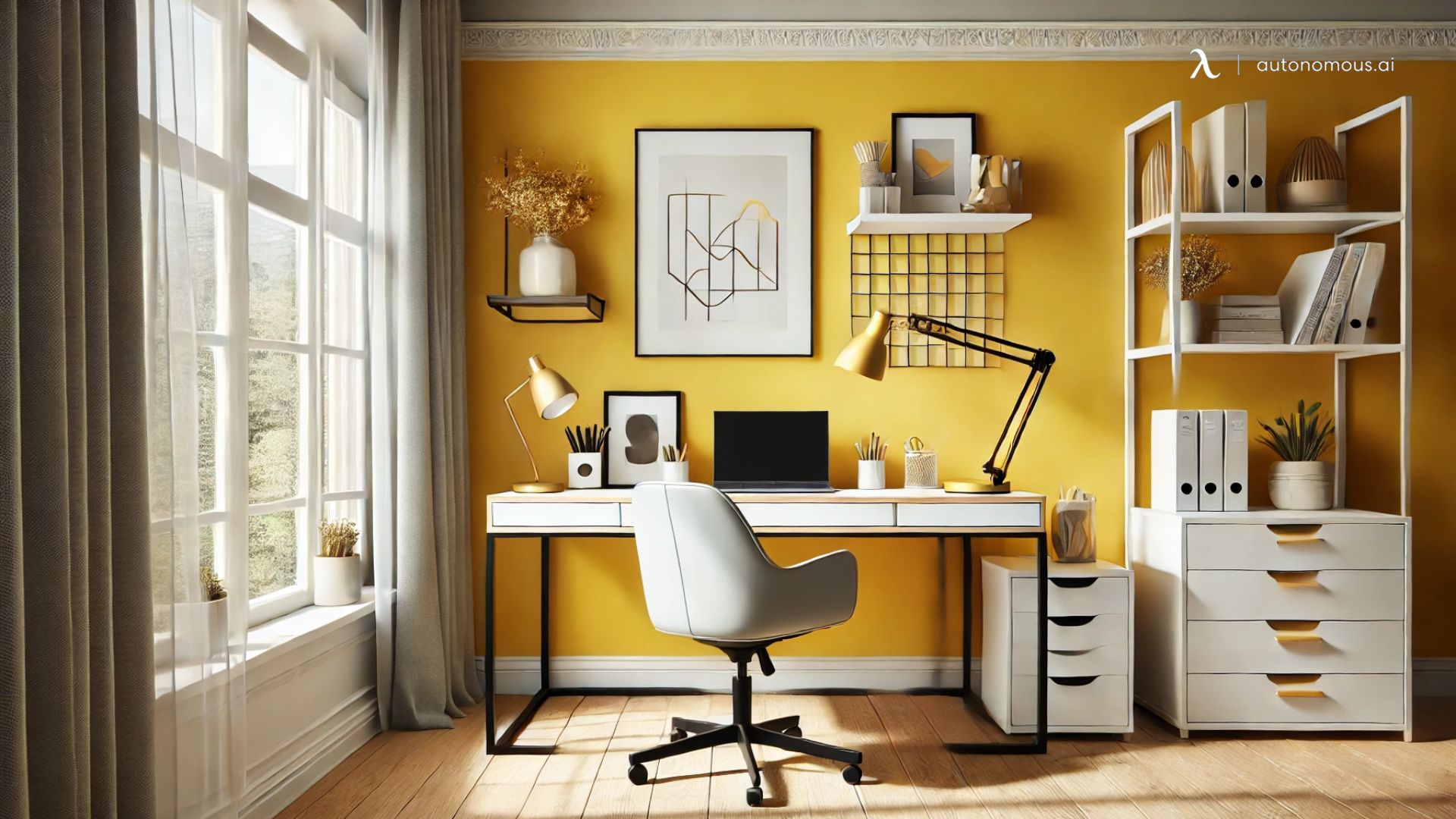
5. Yellow – Best For Creative And Collaborative Zones
Shades to try: Butter yellow, soft gold, mustard, ochre
Yellow brings warmth and optimism. It’s a color that gently boosts mood and encourages interaction, making it great for creative studios, team lounges, and brainstorming corners. Butter yellow and soft gold add brightness without being loud, while mustard and ochre bring more depth and personality. This warm tone also connects to prosperity and optimism, making it relevant when exploring what colors attract money.
Used on one wall or in smaller doses, yellow keeps energy flowing without overpowering the space. It’s a great way to create a cheerful environment that supports fast-paced, idea-driven work.
6. Brown – Best For Stable, Grounded Environments
Shades to try: Taupe, camel, warm walnut, espresso
Brown tones anchor a space and make it feel solid. Lighter shades like taupe or camel work well in offices where trust and stability are central — such as legal practices, therapy rooms, or leadership offices.
Darker walnut and espresso shades add richness and depth, pairing well with natural textures like wood or leather. Brown doesn’t push energy upward or downward; it holds the room steady, which makes it a strong choice for roles that demand reliability and calm presence.
7. Black – Best For Private, Sophisticated Spaces
Shades to try: Matte black, charcoal black, soft ink
Black can turn a plain room into a focused retreat. When used intentionally, it creates a strong, quiet backdrop that blocks out visual distractions. Matte black and soft ink are ideal for accent walls, adding depth without making the space feel closed in.
Charcoal black works well in executive offices, edit suites, or any environment where privacy and intensity are valued. Black pairs beautifully with warm lighting and light furniture to keep the balance right.
8. Coral – Best For Uplifting And Welcoming Spaces
Shades to try: Soft coral, peach blush, sunset coral, terracotta coral
Coral is warm, inviting, and uplifting — a softer alternative to orange that works well in modern paint colors for office spaces. Soft coral brightens shared lounges and creative studios, while terracotta coral gives the room a grounded, modern edge.
This palette works especially well in collaborative areas or hybrid offices where energy and approachability are key. Coral is a great way to spark connection and keep the space feeling fresh.
9. Pastels – Best For Light, Creative Workspaces
Shades to try: Seafoam green, powder blue, pale lilac, buttercream
Pastel colors bring lightness to any office. They reflect soft light and create a calm, creative environment without feeling plain. Seafoam and powder blue work beautifully in smaller home offices or studios where focus and comfort need to blend.
Lilac and buttercream introduce a gentle warmth that lifts the mood without distraction. This palette works best in spaces that thrive on imagination — art rooms, backyard writing studios, and light-filled collaborative hubs.
Each color tells a different story and shapes how a workspace feels. Whether your goal is to inspire creativity, create balance, or invite prosperity, thoughtful use of paint colors for office design can transform how people work and interact with their surroundings.
How To Choose The Right Paint Color For Your Office
Picking the right paint colors for office walls isn’t just about what looks good. It’s about matching the mood and energy of your workspace to the kind of work happening inside. A color that boosts focus in one environment may feel too intense in another. The key is to consider how your space is used day to day.
- Match The Color To The Purpose of The Room
If your space is designed for heads-down, focused work, go for calm and grounding tones like blue, green, or soft gray. For creative and collaborative zones, warm neutrals or earthy tones can help create a lively, balanced flow. Drawing from Feng Shui home office colors can also help align the palette with positive energy.
- Think About Lighting
Natural light will make colors appear softer and warmer. Artificial lighting can sharpen or darken tones. Test paint samples at different times of day to see how they actually look on your walls.
- Balance Intensity
Not every wall needs to be a statement. Use bolder colors on one wall or trim to give structure and personality, and pair them with neutrals for balance. For example, a navy accent wall paired with soft white can keep a space focused yet open.
- Size And Ceiling Height Matter
Light tones help smaller offices feel spacious, while deeper shades can make large areas feel more grounded and intentional. A soft neutral base with strategic accents can work well in flexible spaces or home office paint color setups. Understanding home office dimensions can make it easier to choose colors that fit the scale of your workspace.
- Make It Cohesive
If you have multiple rooms, pick a palette that flows. Varying shades of gray, green, or white can give each area its own character without clashing.
The right office paint colors for productivity aren’t just trendy — they make people feel at ease, focused, and inspired. A well-chosen palette helps your workspace work for you, not against you.
Office Paint Color Combinations That Work
A single shade can set the mood, but thoughtful paint color combinations for office spaces can shape how energy flows throughout the day. The right mix of base and accent colors helps define different zones, balance stimulation with calm, and create an environment that supports productivity without overwhelming the senses.
Here’s how to use modern paint colors for office design strategically.
- Focus Zones: Calm and Clarity
When you want a space that helps people think clearly and stay centered, soft neutrals and muted tones work beautifully. A pale beige base with a sage green accent behind the desk, black trim framing the edges, and soft wood furniture. The result is a focused environment that feels open and grounded at the same time.
These combinations work well in meeting rooms, individual workstations, or home offices where clarity and structure matter. Layering with thoughtful home office wall décor ideas can add subtle depth and texture without disrupting the calm.
- Creative Spaces: Stimulation Without Chaos
In spaces where ideas need room to breathe, warm bases and bold accents create just the right amount of spark. A bright, open studio with warm cream walls, a coral accent behind a collaborative table, and oak trim softening the edges. The accent doesn’t overwhelm the space — it gives it a pulse.
These office paint color combinations are great for collaborative zones, brainstorming areas, and design studios, especially when paired with flexible office layout ideas that support open collaboration.
- Relaxation Corners: Restorative Energy
Some office spaces benefit from a more restorative atmosphere—perfect for break areas or quiet lounges. Combining soft greens or blues with white or warm beige creates a serene palette that lowers stress and gently recharges energy. This mix works especially well in wellness rooms or informal seating areas where people need a mental pause between tasks.
- Tips:
The trick to making these combinations work is controlling intensity. Pairing a soft or neutral base with a saturated accent creates structure without visual clutter. If your accent is deep and bold, keep the surrounding walls light. If your base is dark, choose a muted or warm accent to soften the tone.
Well-designed office paint color combinations don’t just make a space beautiful—they make it functional. By mixing warm and cool tones with purpose, you can support productivity, spark creativity, or build moments of calm exactly where they’re needed.
Common Mistakes To Avoid When Picking Office Paint Colors
Even the best paint colors for office spaces can fall flat when they’re used the wrong way. Choosing the right shade isn’t just about what looks nice on a swatch—it’s about how color behaves in your specific space. Here are some of the most common mistakes people make when picking office paint colors for productivity, and how to avoid them.
- Going Too Bold Without Balance
Bold shades like mustard yellow, coral, or black can look amazing—but too much of them can overwhelm the room. A full wall of a strong color can make a space feel smaller and distracting.
Instead, use bold tones strategically: on a single accent wall, trim, or paired with soft neutral tones and well-placed office accessories helps keep the palette grounded and intentional.
- Ignoring Lighting Conditions
Colors change dramatically depending on the light. A gray that looks cool and calm in natural daylight can turn flat under fluorescent bulbs. A soft beige can shift toward yellow or green tones at night. Always test your chosen paint colors for the office at different times of the day and under the actual lighting used in the space to avoid surprises.
- Forgetting How Colors Interact
Choosing a shade in isolation often leads to mismatched tones. A deep navy might look great on its own but clash with flooring or furniture. Considering how your walls work alongside large pieces like a standing desk or an ergonomic chair ensures the color supports the entire room rather than fighting against it.
- Overusing Pure White
While white is timeless, a space that’s entirely white can feel cold, sterile, or unfinished. Pure white walls often reflect harsh lighting, making the room uncomfortable to work in. Warm whites, creams, or subtle contrast with accent walls can bring dimension back into the space.
- Ignoring Function and Mood
Every area in an office has its own rhythm. A collaborative space doesn’t need the same color scheme as a quiet meeting room. A common mistake is picking one shade for the entire office, which flattens the mood and makes every zone feel the same. Aligning colors with each space’s purpose—like muted blues and greens for focus zones or warm tones for collaborative areas—creates a much more dynamic and functional environment.
- Forgetting the Ceiling and Trim
Ceilings and trim aren’t just finishing touches—they’re part of the color story. A bright white ceiling with dark walls can make a space feel taller, while warm trim can soften sharp contrasts. Ignoring these areas often results in rooms that feel visually incomplete.
Choosing modern paint colors for office spaces isn’t just about picking trendy shades—it’s about using them with intention. Avoiding these common pitfalls will help create a balanced, inviting environment that looks good and actually supports the way people work.
FAQs
1. What is the most relaxing home office color?
The most relaxing paint colors for home office spaces are soft, cool tones like aqua, turquoise, sage green, and pale blue. These shades combine calming green and blue undertones, creating a balanced atmosphere that reduces stress and supports focus. They work especially well in quiet work areas and spaces with plenty of natural light.
2. What is the best home office wall color for productivity?
Neutral tones such as pale gray, beige, and warm white are widely considered the best office paint colors for productivity. They minimize visual distractions and make the space feel open and focused. Pairing these colors with a well-designed desk setup can further enhance concentration and comfort during long work sessions.
3. What are some warm home office colors?
Warm paint colors for the office include soft yellows, peach, warm white, muted pinks, and light terracotta. These tones make a space feel bright, welcoming, and energizing. Warm colors work best in offices with lots of natural light or windows, as light enhances their warmth and depth.
4. Should home office walls be dark or light?
Both dark and light wall paint colors for office spaces can work—it depends on the room’s lighting and your personal preference. Light colors make a space feel open, bright, and spacious. Darker tones can create a cozy, focused atmosphere but require good lighting to avoid a gloomy feel. If your office doesn’t get much natural light, lighter shades are usually the better option.
5. What sheen is best for home office walls?
An eggshell finish is one of the most popular sheens for modern paint colors for office spaces. It’s soft, washable, and has a slight glow that reflects light without being shiny. This makes it practical for high-use areas like home offices while keeping the walls looking elegant and clean.
6. How bright should my home office be?
For a productive workspace, lighting should range between 500 and 1500 lux, depending on your needs and age. Bright paint colors for home office spaces help reflect light, making the room feel more open and comfortable. Lighter shades like white, beige, or pale blue are ideal for enhancing brightness and supporting productivity throughout the day.
7. What is the best pain color for an office?
The best paint colors for office spaces are soft neutrals and muted tones like white, light gray, beige, sage green, or dusty blue. These shades create a calm, focused atmosphere and pair well with different lighting and furniture styles. They’re ideal for supporting productivity and comfort throughout the day.
8. What color to paint office Feng Shui?
In feng shui, office paint colors should support balance and positive energy. Soft greens and blues promote focus and calm, while warm neutrals like beige and cream bring stability. Avoid harsh, overly bright shades that disrupt flow.
9. What color is lucky for the office?
Lucky paint colors for the office often include green (growth and prosperity), gold (success and wealth), and blue (clarity and focus). Using these tones as accents or main wall colors can create a space that feels grounded and abundant.
Conclusion
The right paint colors for office spaces do more than change the look of a room—they shape how people work, think, and feel every day. Whether it’s soft blues that bring calm, greens that steady focus, or warm neutrals that open up a space, each color has a purpose. Strategic combinations, thoughtful lighting, and well-placed accents can turn ordinary walls into powerful design tools.
Color alone, though, isn’t the whole story. The way a workspace is organized can shape how well those colors work. A thoughtful layout, like a 4 person home office workstation, can make it easier to create distinct zones that match different energy levels. If focus is a challenge, considering principles from ADHD home office design can help the space support attention and flow.
And for those who want their workspace to feel more balanced overall, layering in concepts from office Feng Shui 2025 can bring the color palette, layout, and energy into harmony. A well-painted office isn’t just visually appealing—it’s a subtle foundation for a space that works with you, not against you.